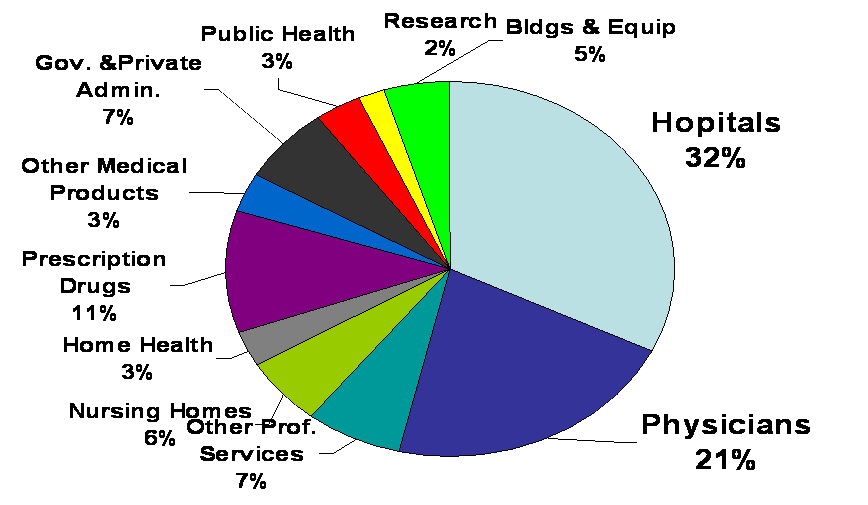
With all the focus on US health spending I thought it would be useful to update the pie chart I’d posted previously that showed 2007 and 2006 National Health Expenditures. So below is the chart showing US health spending for 2009.
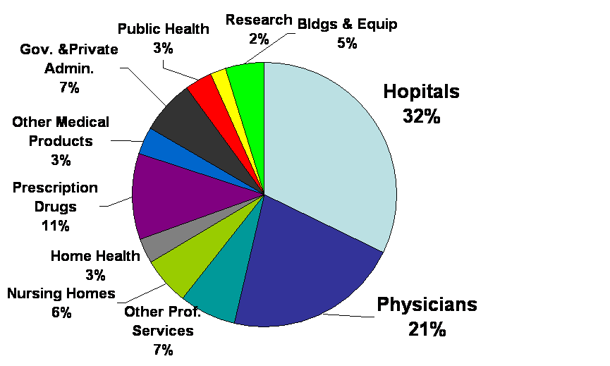
What can be seen by comparing this chart with the previous ones is that the percentages haven’t changed very much. Which means that the foci for cost containment still needs to be on hospitals and physician services and how they influence other types of spending. For example, avoiding hospital admissions, and utilizing clinical services provided by non-physician professionals, etc…. More on this to come in future posts.
